The story
1967: the year the posters started to melt
Every MAD EEL design borrows from one short, loud moment in graphic design. This is the moment.
A poster every week
In 1966 two San Francisco ballrooms began putting on rock concerts every weekend: the Fillmore Auditorium, run by Bill Graham, and the Avalon Ballroom, home of the Family Dog collective. Every show needed a poster. They were printed in small runs, pinned up in shop windows and on telephone poles, and handed out at the door – and within a year people were peeling them off the walls to keep.
The posters had one job: to announce a band, a venue and a date. What made them famous is how badly they wanted to do that job. The lettering swelled until it filled every gap, the colours were chosen to clash, and reading the thing became part of the fun. If you had to stop and squint, the poster had already won.
Letters like liquid
The first of the lettering artists was Wes Wilson. He drew the Fillmore posters by hand, letting the words flow into whatever shape the space left over – a wave, a flame, a face. His starting point was not the sixties at all: it was the swelling poster lettering of the Vienna Secession artist Alfred Roller, which Wilson came across in a 1965 exhibition of German poster art in Berkeley and bent into something entirely his own.
Victor Moscoso arrived with an art-school education, including colour theory under Josef Albers at Yale, and then turned every rule inside out. Where he had been taught that letters must be legible, he made them hard to read on purpose; where colours were supposed to sit calmly next to each other, he picked pairs of equal intensity that vibrate against each other. His Neon Rose series for the Matrix club is still the clearest example of colour used as a physical sensation.
Around them came Rick Griffin, Stanley Mouse and Alton Kelley – together the "Big Five" of the San Francisco poster. Mouse and Kelley lifted images from old books and turned them into new icons; Griffin drew like a surfer who had swallowed a comic book. By 1967 Time magazine had a name for the look: "Nouveau Frisco".
Glowing in the dark
At the same time, a few miles north in Mill Valley, the studio East Totem West printed posters that were made for a different kind of room. Under a blacklight, their fluorescent inks glowed: a Cheshire cat with a grin from another planet, suns, mandalas, a whole bestiary in colours that only exist under ultraviolet. Those posters hung in bedrooms rather than on telephone poles, and they carried the sixties well into the seventies.
The words on our lettering shirt come from the same years: "Flapping Your Arms Can Be Flying" is the title of a 1966 book of poems and drawings by Robert K. Hall and Joseph McHugh. We liked it for the same reason we like the posters – it is serious and silly at exactly the same time.
What we borrow, and what we don't
MAD EEL takes four things from 1967. Two to four flat colours that push against each other instead of blending. Lettering drawn by hand, with all the wobble that implies. One design for one colour world – the purple-on-yellow of the eel, the red thorns of the cat, signal red on black for the lettering – rather than one design printed on everything. And the confidence to make you look twice.
What we leave behind is the paper. A poster had to survive a week on a wall; a shirt has to survive years of washing. That is why the designs sit on a heavyweight, garment-dyed cotton tee that is soft from the first day and gets better the longer you wear it. The idea is the same as it was in 1967: something that vibrates a little, and that you want to keep.
The three designs that came out of it
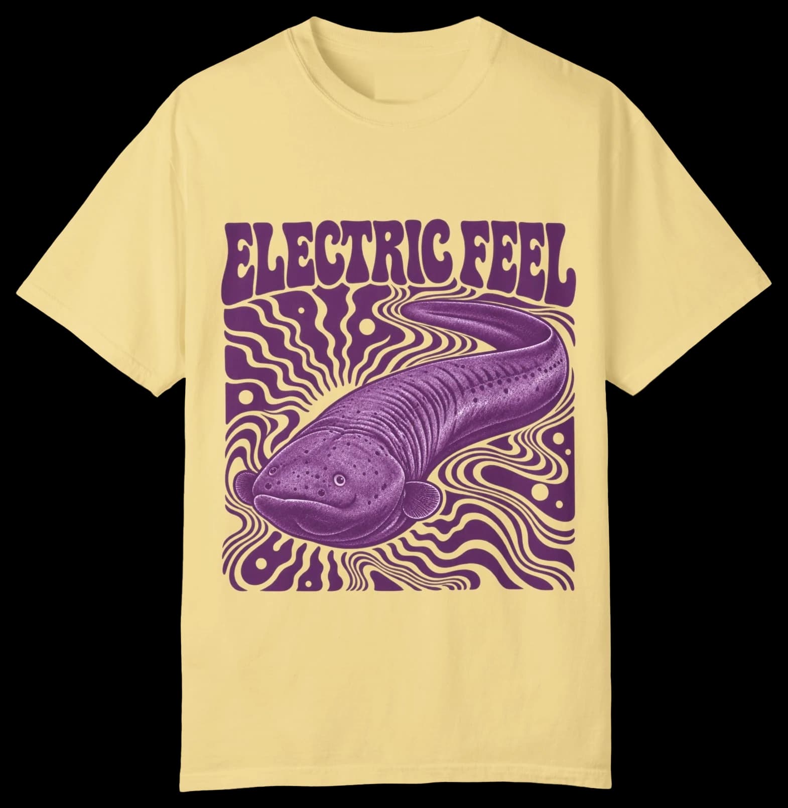
Electric Feel
An electric eel drifting through purple current.
Final price · free shipping to the EU & the US
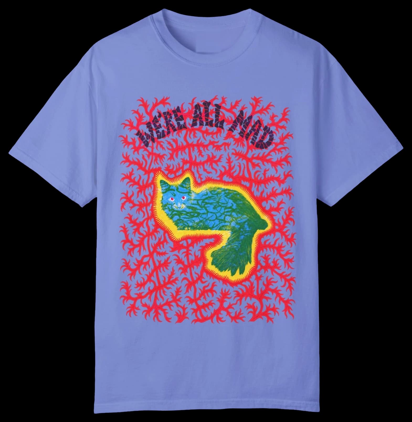
We're All Mad
The Cheshire cat, wrapped in red thorns.
Final price · free shipping to the EU & the US
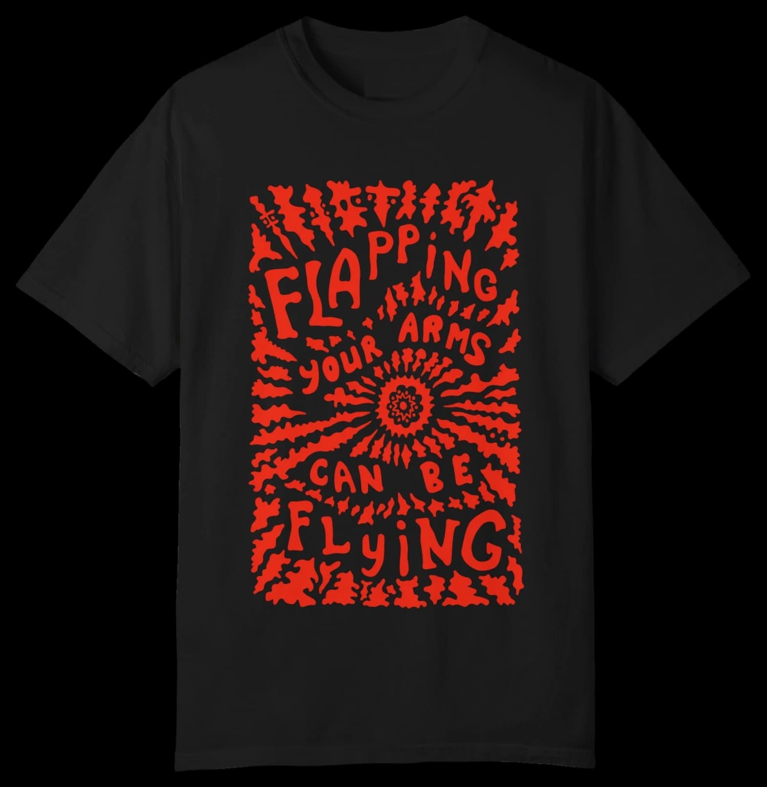
Flapping Your Arms Can Be Flying
Hand lettering that explodes from the centre.
Final price · free shipping to the EU & the US